The trendy colors of Summer 2022
Architecture
This season, it's time for cheerful summer colors such as the new orange, bright pink, iconic blue, deep purple... Without forgetting the luminous pastels to underline a certain idea of lightness and positivity. By touches, in accumulation or via a joyful mixture, color invites itself into the garden.
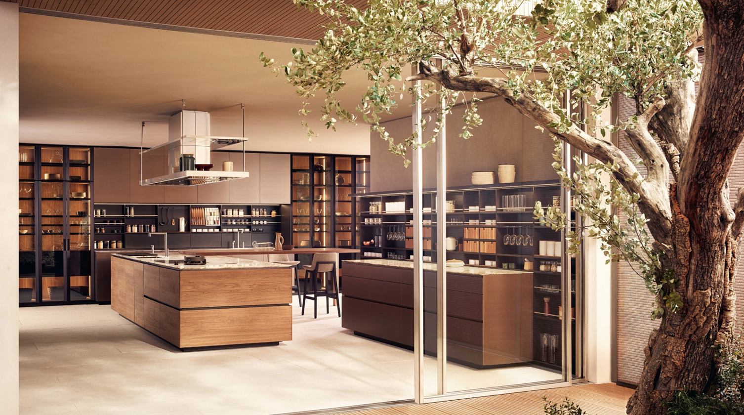
@flexform
When decorating your home, it's important to consider current trends. By choosing colors that match what's popular, you'll be able to create an interior that will hold its appeal for years to come. The color trends for summer 2022 were revealed in a recent survey conducted by Decoist and Pantone (a company well known for naming and describing colors). With these new ideas in mind, we've got some inspiration for you to use in your own home!
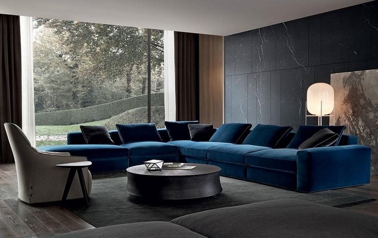
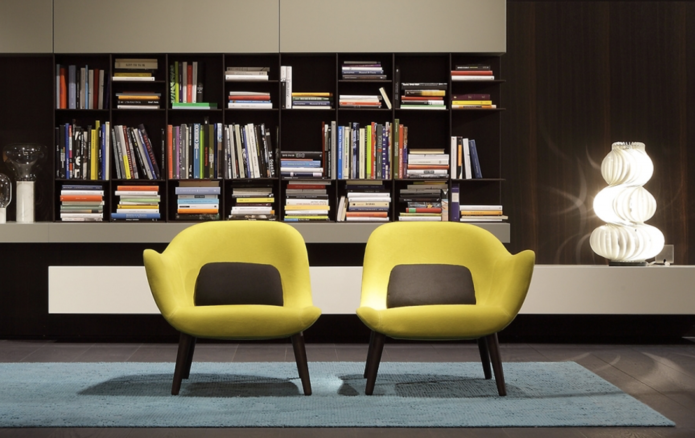
Blue and yellow tones
Blue being a soothing color, it is the ideal choice for your bedroom. If you have trouble sleeping, blue can be a calming way to start the night. It's also great for creating a relaxing environment in your home office or den, especially if you work from home and spend a lot of time on the computer.
Yellow and blue are complementary colors, which means they produce a lot of contrast when paired together. The mixture of these two shades creates a bold and lively piece, perfect for summer fun. You can use a bold yellow to accent the walls, or opt for something more subtle like an off-white shade. Either way, you'll want to pair it with blue accents to keep things from looking too flat or dull. You can start by using blue as an accent color on your pillows or linens, but as always, there are no rules!
@gervasoni 1882
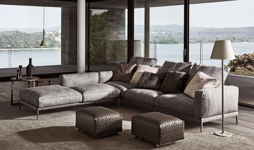
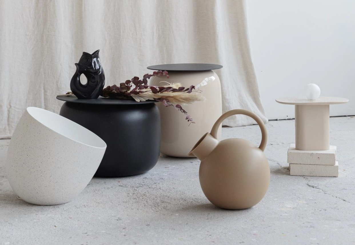
@poliform
@poliform
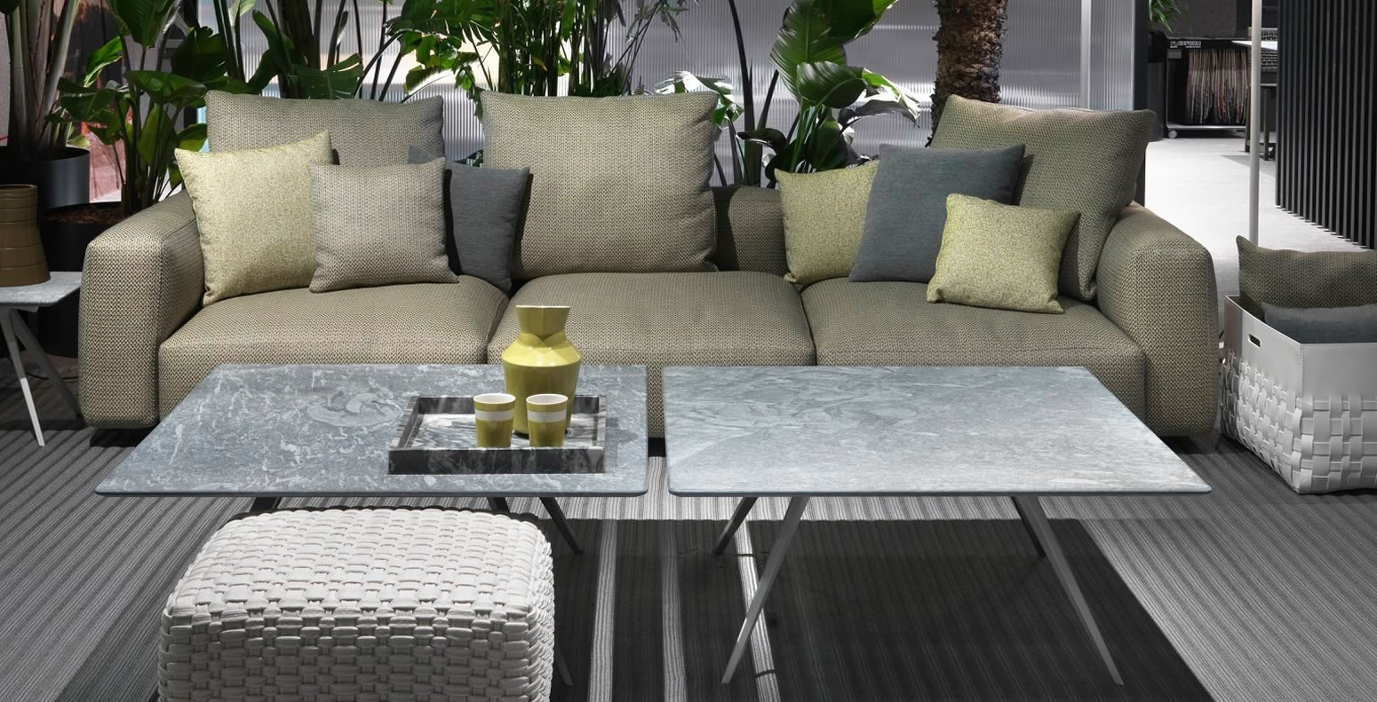
@flexform
Shades of green:
Green is the color of nature and it can bring a sense of comfort and relaxation. It is also associated with freshness, health and fertility. The green tone brings a sense of balance to the space, as it has both warm and cool undertones. If you are looking for something that gives your room a calming effect, this is the best option for you.
Green is a great choice for decorating your interior in summer or spring, as it brings light into the room while adding warmth to your decorating scheme. You can use green alone or combine it with other colors such as white or neutral tones like beige or brown to create beautiful patterns in your home!
@flexform
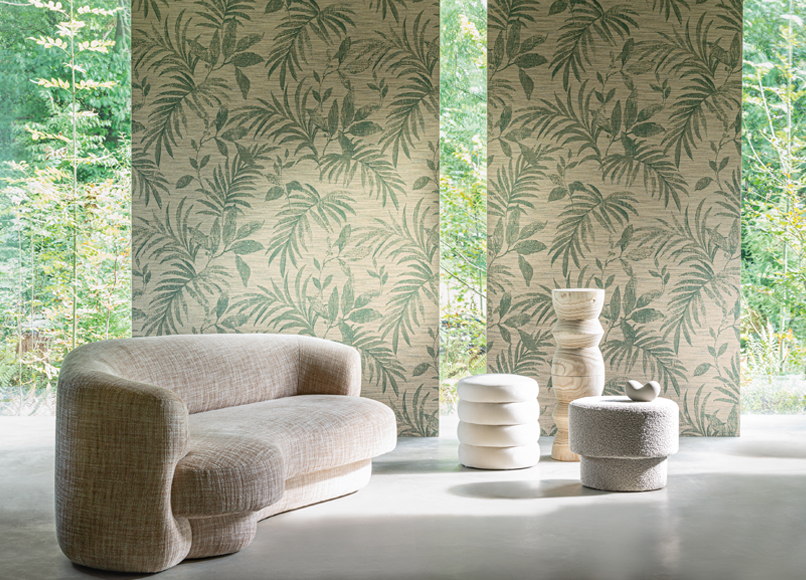
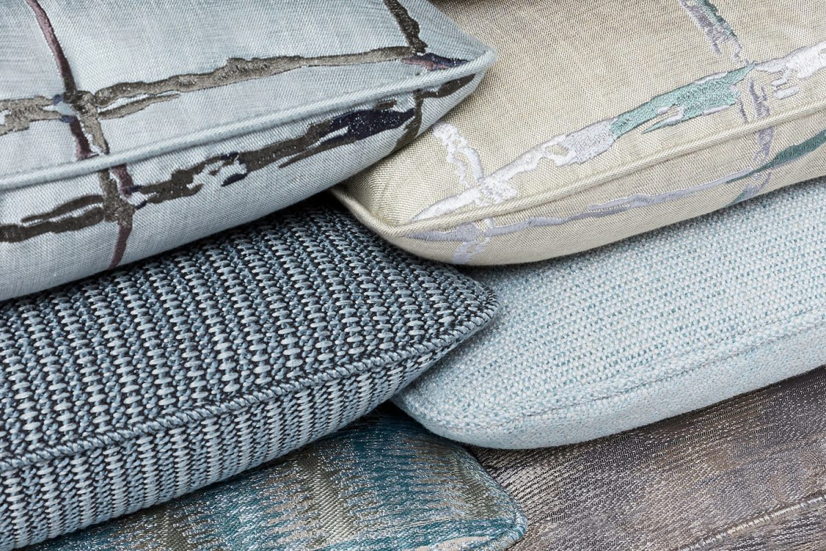
@casamance
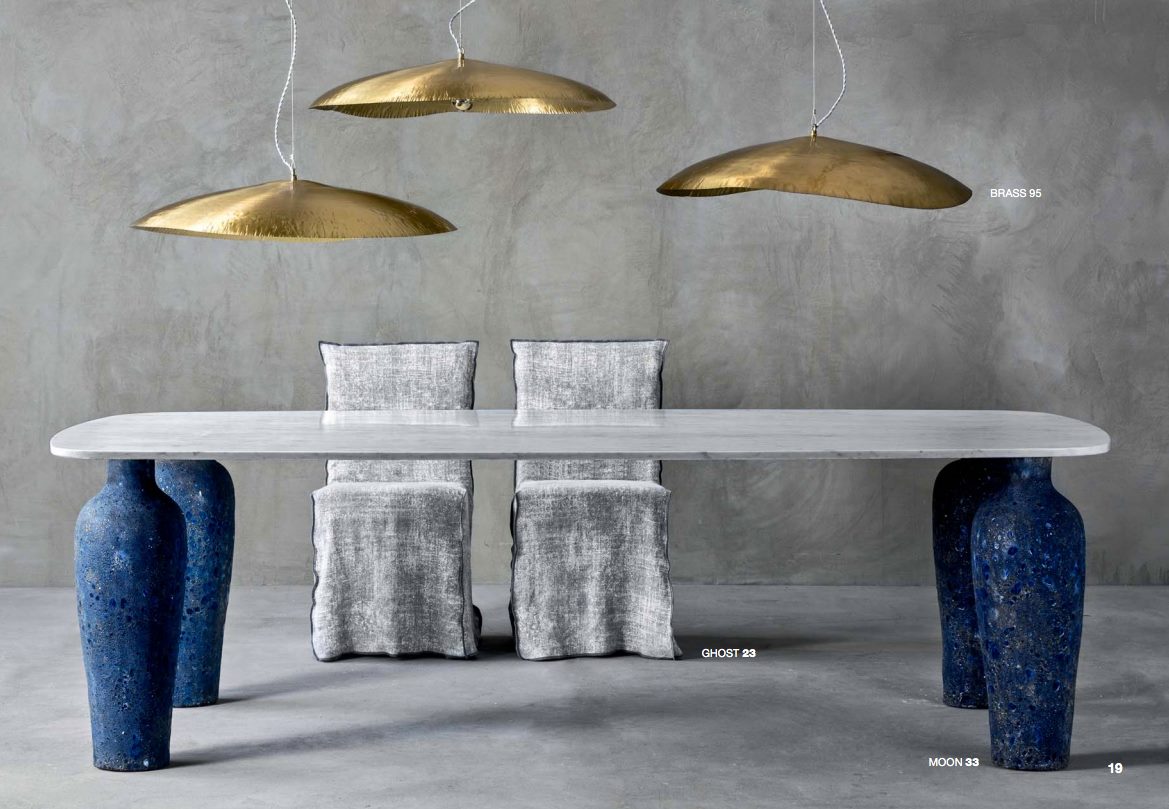
Red and orange tones
Red and orange tones are very popular in the summer. Red is a color of passion, energy and enthusiasm. It creates an intense atmosphere in the room, which can be used to create a dynamic mood. The combination of red and orange creates a rich effect, which will allow you to create an unforgettable interior design concept with an oriental look.
Orange is one of the hottest colors you can use for summer, and it's also a good choice for decorating. Orange's liveliness makes it a great choice for any room in your home that gets lots of natural light.
For example, orange is ideal in kitchens as it brings warmth to an otherwise cold space. Orange cabinets are also popular because they make meal preparation easier: the color makes it easy to find utensils or pans! Thanks to its stimulating properties, orange is sure to brighten up everyone's day!
Paints and fabrics from this palette will decorate your home in an original way and help you emphasize its uniqueness. Red tones will also add warmth to your home decor, making it comfortable and cozy.
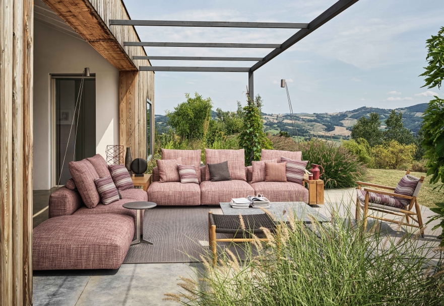
@flexform
@smania
@poliform
Grey
Grey is a great color to use in rooms with low light. It can be used for walls and furniture, depending on the style of your home, but it's important to be careful not to overuse it. If you have a lot of gray in your living room, add pops of color in accessories like throw pillows or flowers.
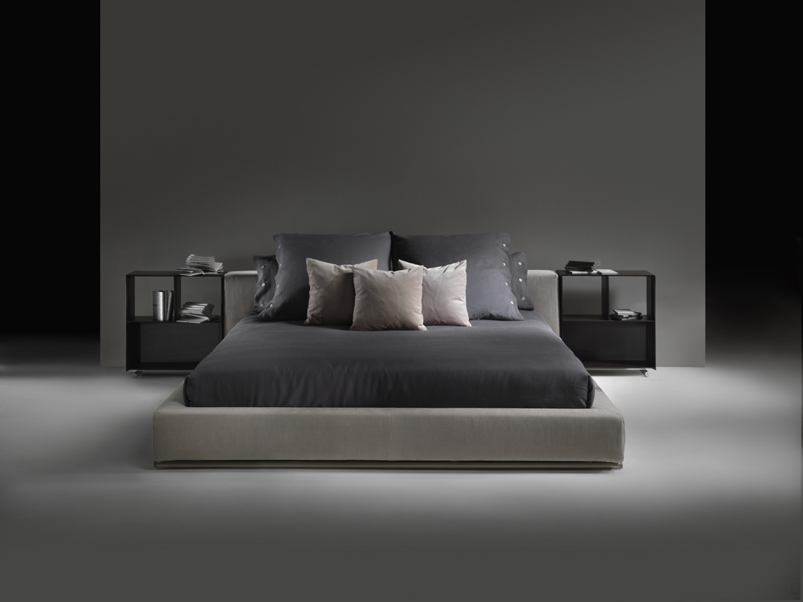
@flexform
@flexform
Pastel colors
Pastel colors are soft and pleasant. They are light and airy, feminine and delicate. The pastel colors give your space a relaxed feel, which is perfect for the summer as it's hot outside!
The most popular pastel colors to decorate your home this season are: purple, baby blue, pink and mint green. If you want your home to look more modern, you should opt for gray rather than white as the main color in your decorating scheme. Gray is a neutral color that can be combined with many other shades to create an elegant look for any room in the house, be it the living room or the bedroom, etc.
Using pastels can also help you inspire inner peace when trying to unwind after a long day, as they are soothing yet bright enough not to be boring at any time of the day.
@Faience de Charolles
@armanicasa
To remember :
Choosing the right color palette can make all the difference in creating the atmosphere of your space. Use these summer trend predictions to pick out new pieces and give your home an instant refresh. But more than that, they are an opportunity to reflect on how we use color in our daily lives to set a mood, highlight an element, shake things up and refresh our rooms.
Simplify your design decisions by choosing a color scheme and layout that will complement your existing furniture and accessories, while creating an interior design that is both welcoming and functional. If you're ready to take on the interior design project, call us today to arrange a consultation at Segraeti Interiors.
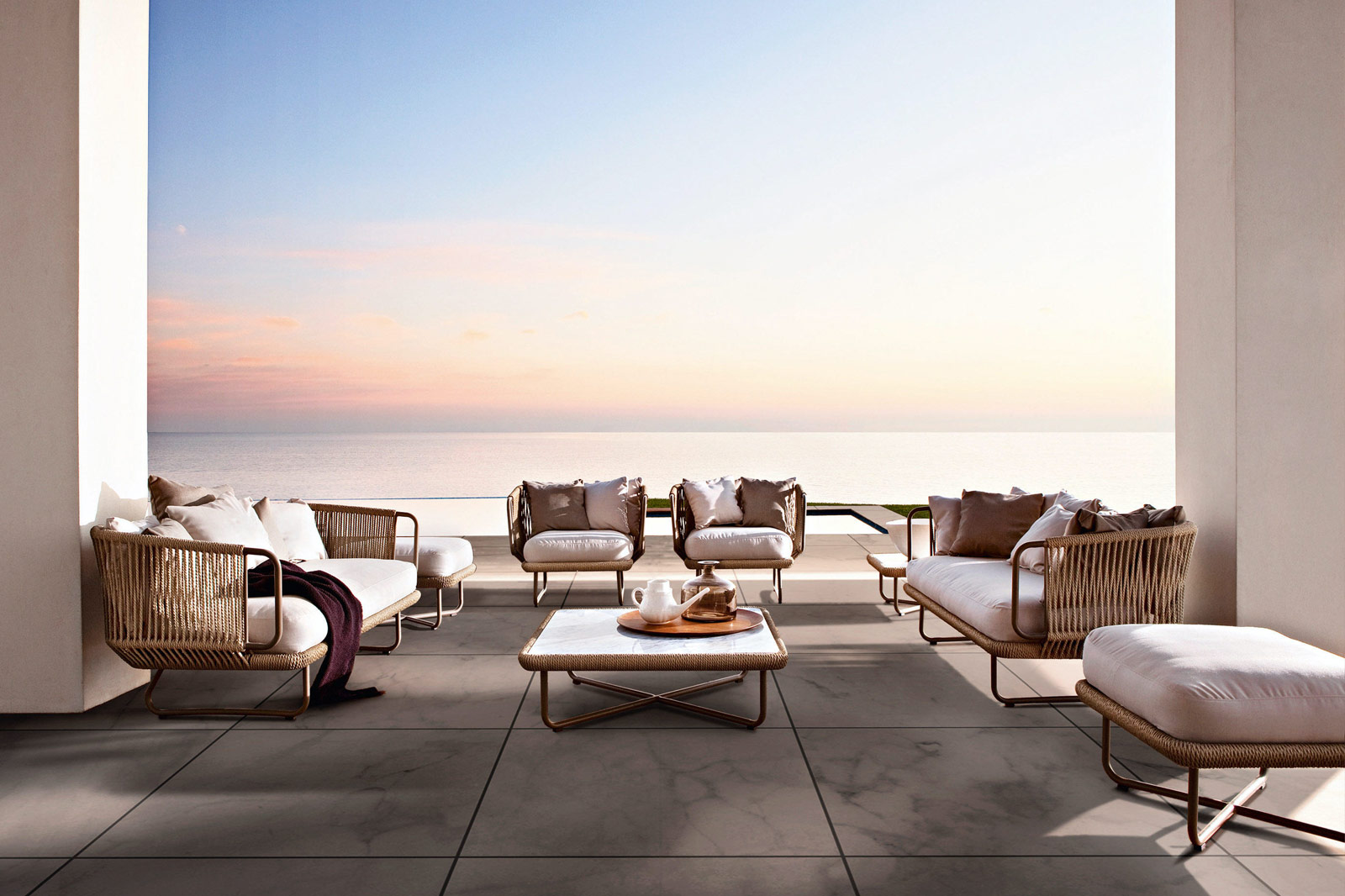
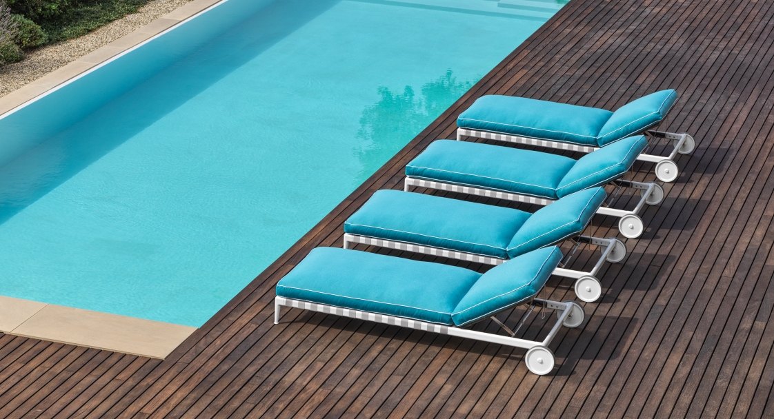
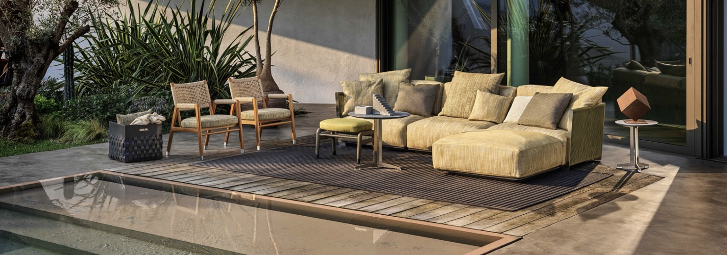
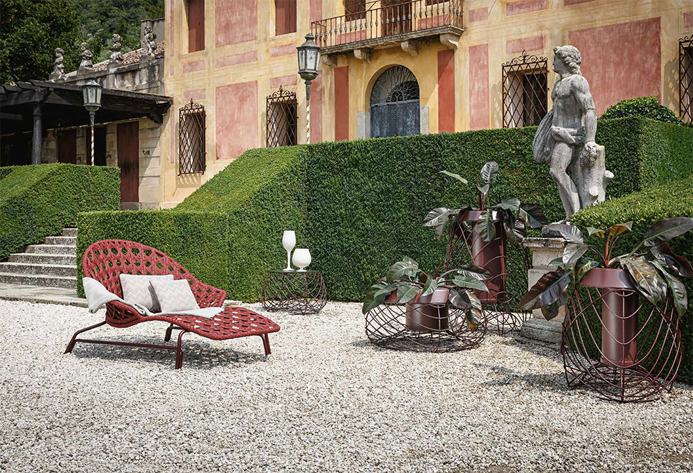
@varaschin